As lead creative for Furman's marketing initiatives, I have designed and executed numerous target-specific campaigns across digital and organic social channels. Each campaign speaks directly to its audience, using targeted messaging, visuals, and content to capture attention and spark engagement.
With focused and consistent efforts across platforms, these efforts have increased yield and strengthened brand recognition, building a more recognizable and trusted presence for Furman in the market.
As Creative Director of Furman Magazine, I work closely with editors, designers, freelancers, web developers, and vendors to deliver the university’s most forward-facing publication. I work collaboratively to procure compelling content, communicate clear design direction, schedule photo shoots, and oversee production while acting as a lead designer.
Furman Magazine is published in print and online twice a year and delves into the stories and happenings within Furman University and its community, covering a wide range of rich topics, including campus news, alumni updates, features, and profiles. As Creative Director for the magazine, I put each print and digital issue through the paces so our subscribers can engage with vibrant visual content. Each issue is aimed at a diverse audience, including alumni, students, staff, and the broader community. It's a vibrant source of information and a platform for sharing the university's accomplishments, initiatives, and the stories of its people.
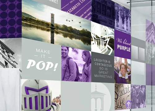
As design and project lead for an array of Furman's Admissions marketing campaigns, I have developed the look, tone, and feel that carry the brand across digital and print, from concept through production and asset management. I have partnered with photographers and vendors to bring each campaign to life, keeping quality, timelines, and brand standards on track. I also mentored and art directed student workers, giving them clear direction, honest feedback, and hands-on opportunities to build real-world design skills. Together, we created persuasive, on-brand recruitment work that raised brand awareness and considerably increased enrollment yield.
As design and project lead, I worked closely with campus partners and directors to bring the vibrancy and energy of Furman to life through environmental graphics and signage on campus and across Greenville. Each project began with deep dives, thoughtful questions, and active listening, so I understood the audience, purpose, and need behind every space. From concept and design through hands-on execution and installation, I guided each project as it took a unique, inspired form. From the fresh and innovative feel of Furman’s Innovation Lab to bold and more collegiate graphics on campus, each space was crafted with purpose and intention in every detail.
Located in Crescent One, Furman Innovation Lab is a collaborative workspace for entrepreneurs, organizations, and Furman programs. Linking Furman University to downtown Greenville, the workspace hosts a range of Furman programs and services and provides space for individuals, teams, and companies to collaborate and work.
Furman’s partnership with the Bon Secours Wellness Arena features Furman’s main Church Street entrance graphics and other digital branding inside the arena.
On campus, graphics have been developed in collaboration with many departments to create branded hallways, classrooms, and entrances, including University Communications, Business and Accounting, and Education.
Developing the clean, elevated, and understated feel for the 2019 President’s Report, “Reflecting on Our Calling,” was a joy, as was working hand-in-hand with the editor at the time. As art director, we worked collaboratively to unearth the perfect images and wordsmith the most telling headlines. With all eyes on this first president’s report, the publication came together and was received beautifully. The report earned a Gold CASE Circle of Excellence Award in recognition of the work. The report provided an in-depth look into the university’s admissions, athletics, diversity and inclusion efforts, community impact, and development initiatives, underscoring The Furman Advantage approach to education.
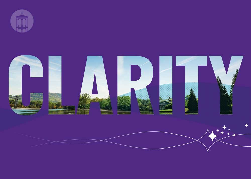
Furman University launched The Clearly Furman capital campaign to raise $426 million in support of strategic priorities including scholarships, academic programs, and campus enhancements. As creative lead on a collaborative team effort, I helped conceptualize the proof-of-concept and Clearly Furman logo, which was crucial in laying the groundwork for a multitude of projects that would be created not only to launch the campaign, but also to see it through years of fundraising. The theme needed to feel fresh, energetic, and real, yet distinctive with its own Furman personality.
I brought the bold signature theme to life, carrying it through dozens of print projects, designing case statement collateral, along with the invitations, signage, and web graphics that promoted the weekend launch party. To carry the brand forward, I incorporated the Clearly Furman identity into Furman Magazine, and our team integrated it into Development materials, including Canva templates that let the Development team produce on-brand work for the duration of the campaign
In the Kitchen at White Oaks is part cookbook and part history book, celebrating the 25th anniversary of Homozel Mickel Daniel's bequest of White Oaks to Furman and its designation as the University President's Home. The residence is a time capsule of lovely vintage elegance, and it provided the inspiration and much of the fabulous content for the book.
As creative director, I worked closely with the writer, the photographer, and Furman's Special Collections to bring the book to life. I designed its pages to showcase rooms and treasures of White Oaks, letting the home's character help shape the look and feel of the cookbook. I also helped manage the planning and execution of the extensive food photoshoot, polishing spoons, tasting cake recipes, and adjusting the fine details of every food shot for the camera. The cookbook includes recipes from several former first ladies of the university, First Gentleman Charles Davis, and Mrs. Daniel herself, whose recipes were discovered in a chest of drawers in the White Oaks library.
Working with Furman’s development team, I developed the look and feel of the Partners Program initiative, which directly unites students with donors, giving donors the opportunity to see the direct and immediate impact of their investment through student relationships.
I designed the logo and identity, then carried the brand theme through a suite of print collateral and web design. While staying unmistakably part of the overarching Furman brand, the Partners Program system is purposeful in feeling current and accessible while being easily identified as its own programming.
Launching The Furman Advantage was the classic example of flying the plane as you build it. The language around Furman's flagship commitment to students, including engaged learning, reflection, belonging, and mentoring, was still in its first drafts and being heavily vetted, while the logo and branding were still in ideation and concept. The announcement launch event was already set, and luckily, the idea was clear.
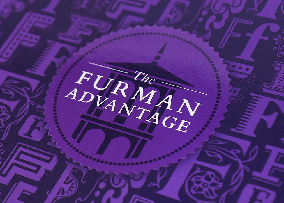
As design lead, I was delighted to concept and design the logo and branding of The Furman Advantage, now well established. To communicate the vision and stretch the Furman brand, I worked closely with the leadership team through rounds of iterations until the messaging and visuals were fully aligned. The logo needed to be unquestionably Furman, with branding elements and themes that could stand on their own and work within Admissions and other Furman-branded materials. I worked with students and photographers to create authentic photography, while developing elements and a theme that translated across platforms, including the announcement launch event, online presence, and strategic printed materials. The identity still sits comfortably within the broader Furman brand.
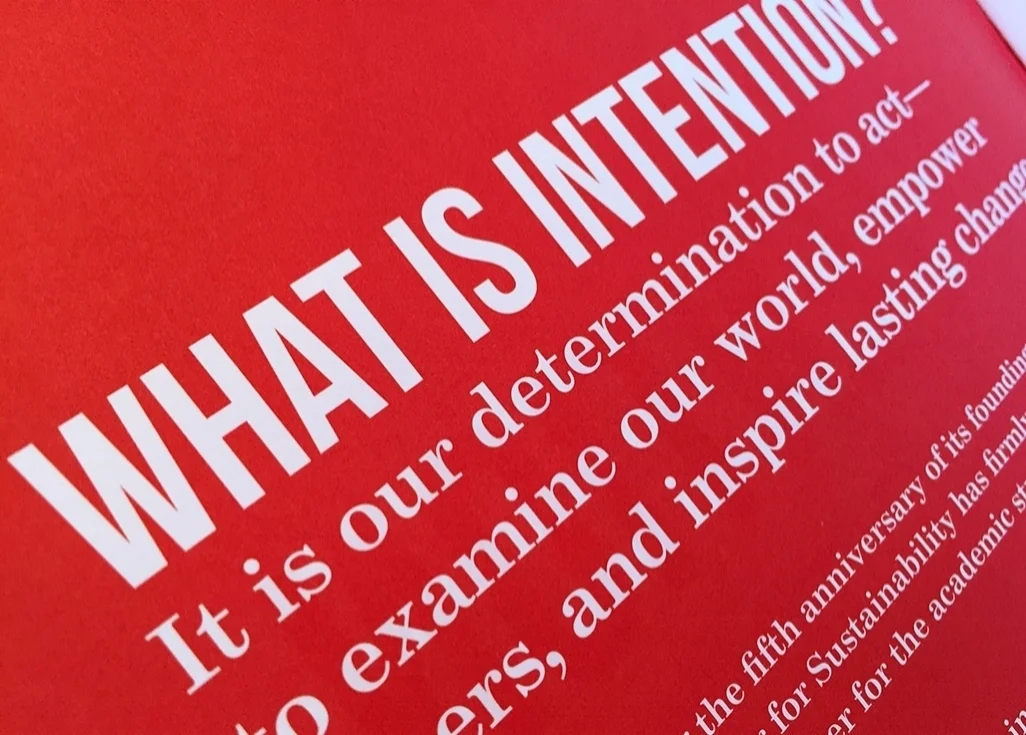
For years, The Shi Center for Sustainability has published an annual report sharing its programs and successes with the Furman and Greenville communities. This report highlighted the work of the Shi Center Student Fellows and Faculty Affiliates, along with many other initiatives and opportunities the Center supported throughout the year.
As art director, I worked closely with senior leadership as the concept of "Intention" set the stage for this multi-page book. Bold, clear messaging, paired with storytelling and vivid design, showcased the Center's accomplishments and direct impact on the community. Note that the Center worked somewhat independently before folding into the branding of Furman’s institutes, which explains the absence of purple.
As lead in design and art direction, I successfully helped execute the complex and groundbreaking project of creating four logos for the newly established pillar Institutes, all under Furman's overarching wordmark. Each logo came with its own system, and together they work under the Furman brand.
Each logo needed to resonate with each institute's director, Furman's president, and beyond, creating the challenge of balancing the preferences of multiple personalities with functionality and purpose. The resulting logos work well as a system and have been woven into Furman's logo system.
I designed the stationery packages for each logo and have been instrumental in creating branded materials and templates for each, including Canva templates.
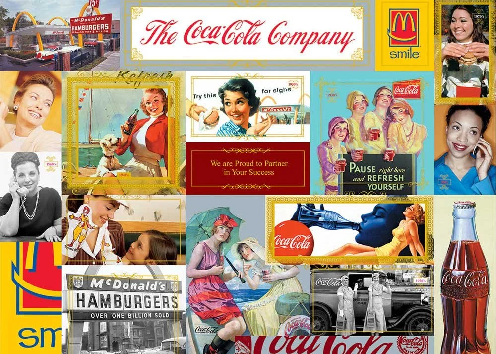
As lead creative, client liaison, and project manager, I thoroughly enjoyed working on a wide range of Coca-Cola sponsorship initiatives. From concept and design through implementation, I partnered with different Coca-Cola clients on projects including logo and collateral development for the Domino's CASE Award, FIFA soccer promotions, and numerous trade show displays. Through discovery, I quickly learned the niche purpose of each sponsorship program, which laid the groundwork for visually bringing two brands together. Sponsor brands often arrived with their own personality, yet they worked beautifully under the Coke brand. The real question was which PMS red to specify in production.
Projects include: The Coca-Cola sponsorship display graphics for the McDonald's Women Operators Network (WON) trade show presence; Domino’s CASE Award incentive campaign sponsored by the Coca-Cola Company; and The Coca-Cola Company sponsors the quarterly publication of Behind the Screams for Six Flags, highlighting national marketing programs, promotions, and in-park initiatives.
Inspired by the character of the land, I led the creative direction, logo development and branding for Laurel Preserve, creating a visual identity that captures the quiet scale, natural richness and beauty of this community development.
Tucked away in the uppermost reaches of South Carolina, where the Blue Ridge Mountains meet the Piedmont, Laurel Preserve is a large, unbroken land tract bordered by the pristine Jocassee Gorges. This ecologically unique area is covered with forested slopes of age-old hardwoods, rare plant species and meandering mountain streams.
Watercolor sketches and a palette found in nature give the brand a look and feel that is high-end yet warm and approachable, setting the backdrop for a tranquil, nature-centered lifestyle.
As lead designer, I developed the visual theme for Furman's Homecoming Weekend, "Come Home," and designed and implemented the collateral that carried it across print, web and social. The campaign began with a mailed Save the Date that drove website registration, followed by branded promotional pieces, including a T-shirt and commemorative poster, that extended the theme to campus.
As lead creative, I worked closely with the book's writer, alongside photographers and Piedmont Hospital's archivists, to create A Century of Better Care, a commemorative book marking the hospital's 100th anniversary. Our collaboration with Piedmont's archive department shaped every page, turning a century of institutional history into a cohesive, visually rich keepsake.
The 116-page historical retrospective chronicles Piedmont's story through biographical briefs on the people who shaped it, vintage photography from the archives, and preserved found objects. Together, these elements offer an intimate look at how the hospital grew and the lasting contributions it has made to medicine.
The book launched a year of centennial events celebrating Piedmont's legacy and its impact on the medical community.